2: Clustering using k-means and GMM
Contents
2: Clustering using k-means and GMM
Clustering is the task of grouping a set of objects without known their labels. It is one of the most fundamental methods for unsupervised learning. We will start with the simple k-means method and then progress to the Gaussian Mixture Method (GMM).
This notebook is based on a blog post by Jake VanderPlas on clustering with scikit-learn, an excerpt from his book Python Data Science Handbook.
# sklearn
from sklearn.datasets import make_blobs
from sklearn.cluster import KMeans
from sklearn.mixture import GaussianMixture as GMM
from sklearn.mixture import BayesianGaussianMixture as BGM
from sklearn.datasets import make_moons
from sklearn import metrics
import sklearn.datasets

# helpers
import numpy as np
import matplotlib.pyplot as plt
from matplotlib import cm
import matplotlib as mpl
plt.style.use('ggplot')
K-means
K-means is probably the most popular clustering method. It clusters the data by minimising the within-cluster sum of squares (WCSS), i.e., given data $\mathbf{x}$ and the number of clusters $k$, to find a set of clusters $\mathbf{S}={S_1, S_2, \cdots, S_k}$ by
$$\operatorname*{arg,min}\mathbf{S} \sum{i=1}^k \sum_{\mathbf{x}\in S_i}\lVert\mathbf{x}-\mathbf{\mu}_i\rVert^2,$$
where $\mathbf{\mu}_i$ is the mean of points in cluster $S_i$.
Data generation
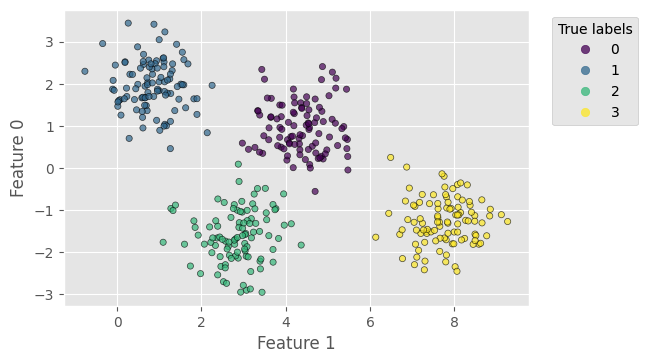
First, similar to classification_decision_tree.ipynb, we use a dataset generated by the make_blobs method from sklearn. It has 400 samples with 2 features, 4 centres and a standard deviation of 0.6. Note that we flip the axes (2nd feature as $x$-axis) in the plot for better visualisation.
# generate Gaussian blobs
X, y_true = make_blobs(n_samples=400, n_features=2, centers=4,
                       cluster_std=0.6, random_state=0)

# plot data points with true labels
plt.figure(dpi=100)
scat = plt.scatter(X[:, 1], X[:, 0], c=y_true, s=20, alpha=0.7, edgecolors='k')
plt.xlabel('Feature 1')
plt.ylabel('Feature 0')
plt.gca().add_artist(plt.legend(*scat.legend_elements(),
                                title='True labels', bbox_to_anchor=(1.25, 1.)))
plt.gca().set_aspect(1)
plt.show()
Clustering using k-means
With sklearn, clustering using k-means is only a few lines:
# create k-means and fit
kmeans = KMeans(4, random_state=0).fit(X)

# make predictions
y_kmeans = kmeans.predict(X)
Now we can plot the resultant clusters. For better visualisation, we add the “range circles” to the plot, centred at the cluster means (kmeans.cluster_centers_) and having radii from the means to the farthest points.
# plot data points with predicted labels
plt.figure(dpi=100)
scat = plt.scatter(X[:, 1], X[:, 0], c=y_kmeans, s=20,
                   alpha=0.7, edgecolors='k', cmap='viridis')
# add the range circles
for icenter, center in enumerate(kmeans.cluster_centers_):
    radius = np.max(np.linalg.norm(X[y_kmeans == icenter] - center, axis=1))
    circle = plt.Circle((center[1], center[0]), radius, alpha=.3,
                        color=cm.get_cmap('viridis', kmeans.n_clusters)(icenter))
    plt.gca().add_artist(circle)
plt.xlabel('Feature 1')
plt.ylabel('Feature 0')
plt.gca().add_artist(plt.legend(*scat.legend_elements(),
                                title='Clusters', bbox_to_anchor=(1.2, 1.)))
plt.gca().set_aspect(1)
plt.show()
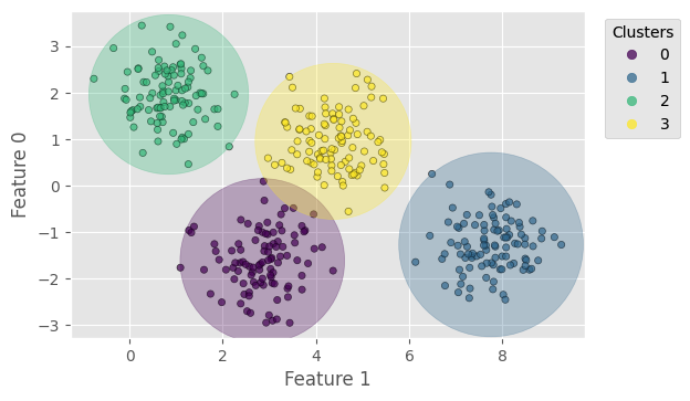
With cluster_std=0.6, k-means yields a prediction exactly the same as the ground truth; the only difference is the order of labels (which is reasonable because k-means takes in no information about the true labels). We can compute the following score for the clustering, all independent of the label orders:
Homogeneity score: a clustering result satisfies homogeneity if all of its clusters contain only data points which are members of a single class;
Completeness score: a clustering result satisfies completeness if all the data points that are members of a given class are elements of the same cluster;
V-measure score: the harmonic mean between homogeneity and completeness.
For, cluster_std=0.6, the scores should all be 1. Try a larger cluster_std.
# print scores
print('Homogeneity score = %.3f' % metrics.homogeneity_score(y_true, y_kmeans))
print('Completeness score = %.3f' % metrics.completeness_score(y_true, y_kmeans))
print('V-measure score = %.3f' % metrics.v_measure_score(y_true, y_kmeans))
Homogeneity score = 1.000
Completeness score = 1.000
V-measure score = 1.000
Gaussian Mixture Method
In k-means, the objective function (the WCSS) is isotropic; for example, it defines a circle in 2D (2 features) and a sphere in 3D (3 features). If the data distribution is anisotropic along the dimensions (e.g., all the data points lie on the $x$-axis), k-means will suffer from over-expanded cluster ranges along the minor dimensions.
The Gaussian Mixture Method (GMM) can overcome this difficulty. In GMM, each cluster is defined by a normal distribution rather than a single point (i.e., the centres in k-means), as shown in the following figure (source). In a multivariate problem, each cluster is characterised by a series of Gaussian bells along each of the dimensions, forming an ellipsoidal range that can handle anisotropic data.
In GMM, clustering is conducted by maximising the likelihood of each Gaussian fitting the data points belonging to each cluster, so the solution is a maximum likelihood (ML) estimate. Further, variational inference can be introduced to GMM, giving rise to the Bayesian GMM, of which the solution is a maximum a posteriori probability (MAP) estimate.
Data transformation
To create an anisotropic data distribution, we stretch the previous dataset by applying a random transformation matrix to the coordinates:
# stretch the data
# for reproducibility, we fix the random seed here
rng = np.random.RandomState(13)
X_stretch = np.dot(X, rng.randn(2, 2))

# plot data points with true labels
plt.figure(dpi=100)
scat = plt.scatter(X_stretch[:, 1], X_stretch[:, 0], c=y_true, s=20,
                   alpha=0.7, edgecolors='k')
plt.xlabel('Feature 1')
plt.ylabel('Feature 0')
plt.gca().add_artist(plt.legend(*scat.legend_elements(),
                                title='True labels', bbox_to_anchor=(1.35, 1.)))
plt.gca().set_aspect(1)
plt.show()
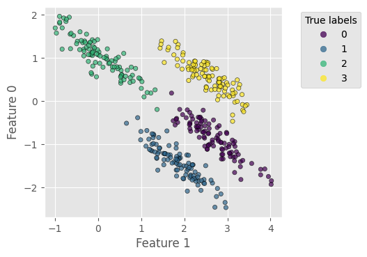
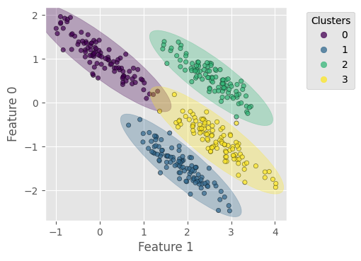
Let us try k-means with this stretched dataset – the result clearly reflects the difficulty described above:
# create k-means and fit
kmeans_stretch = KMeans(4, random_state=0).fit(X_stretch)

# make predictions
y_kmeans_stretch = kmeans_stretch.predict(X_stretch)

# plot data points with predicted labels
plt.figure(dpi=100)
scat = plt.scatter(X_stretch[:, 1], X_stretch[:, 0], c=y_kmeans_stretch, s=20,
                   alpha=0.7, edgecolors='k', cmap='viridis')
# add the range circles
for icenter, center in enumerate(kmeans_stretch.cluster_centers_):
    radius = np.max(np.linalg.norm(X_stretch[y_kmeans_stretch == icenter] - center, axis=1))
    circle = plt.Circle((center[1], center[0]), radius, alpha=.3,
                        color=cm.get_cmap('viridis', kmeans_stretch.n_clusters)(icenter))
    plt.gca().add_artist(circle)
plt.xlabel('Feature 1')
plt.ylabel('Feature 0')
plt.gca().add_artist(plt.legend(*scat.legend_elements(),
                                title='Clusters', bbox_to_anchor=(1.3, 1.)))
plt.gca().set_aspect(1)
plt.show()

# print scores
print('Homogeneity score = %.3f' % metrics.homogeneity_score(y_true, y_kmeans_stretch))
print('Completeness score = %.3f' % metrics.completeness_score(y_true, y_kmeans_stretch))
print('V-measure score = %.3f' % metrics.v_measure_score(y_true, y_kmeans_stretch))
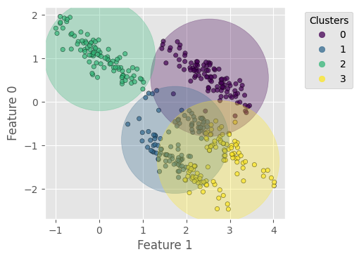
Homogeneity score = 0.700
Completeness score = 0.701
V-measure score = 0.701
Clustering using GMM
With sklearn, using GMM involves nothing more complicated than using k-means except for a few more hyperparameters (see the documentation). The number of clusters is given by the argument n_components. To guarantee that we always reach the global optimal solution, here we specify n_init=20, the number of initial random states from which the best result will be chosen.
# create GMM and fit
gmm = GMM(n_components=4, n_init=20).fit(X_stretch)

# make predictions
y_gmm = gmm.predict(X_stretch)
Next, we plot the resultant clusters with the “range ellipses” and print the scores:
# function to add ellipses of a GMM to a plot
def add_ellipses(gmm, ax, cmap, weight_threshold=None):
    for n in range(gmm.n_components):
        # check weight
        if weight_threshold is not None:
            if gmm.weights_[n] < weight_threshold:
                continue
        # get covariances
        if gmm.covariance_type == 'full':
            covariances = gmm.covariances_[n][:2, :2]
        elif gmm.covariance_type == 'tied':
            covariances = gmm.covariances_[:2, :2]
        elif gmm.covariance_type == 'diag':
            covariances = np.diag(gmm.covariances_[n][:2])
        elif gmm.covariance_type == 'spherical':
            covariances = np.eye(gmm.means_.shape[1]) * gmm.covariances_[n]
        # compute ellipse geometry
        v, w = np.linalg.eigh(covariances)
        u = w[0] / np.linalg.norm(w[0])
        angle = np.degrees(np.arctan2(u[0], u[1]))
        v = 4. * np.sqrt(2.) * np.sqrt(v)
        ell = mpl.patches.Ellipse((gmm.means_[n, 1], gmm.means_[n, 0]), v[1], v[0],
                                  90 + angle, color=cmap(n), alpha=.3)
        ax.add_artist(ell)

# plot data points with predicted labels
plt.figure(dpi=100)
scat = plt.scatter(X_stretch[:, 1], X_stretch[:, 0], c=y_gmm,
                   s=20, alpha=0.7, edgecolors='k', cmap='viridis')
add_ellipses(gmm, plt.gca(), cm.get_cmap('viridis', gmm.n_components))
plt.xlabel('Feature 1')
plt.ylabel('Feature 0')
plt.gca().add_artist(plt.legend(*scat.legend_elements(),
                                title='Clusters', bbox_to_anchor=(1.3, 1.)))
plt.gca().set_aspect(1)
plt.show()

# print scores
print('Homogeneity score = %.3f' % metrics.homogeneity_score(y_true, y_gmm))
print('Completeness score = %.3f' % metrics.completeness_score(y_true, y_gmm))
print('V-measure score = %.3f' % metrics.v_measure_score(y_true, y_gmm))
Homogeneity score = 0.980
Completeness score = 0.980
V-measure score = 0.980
In addition, because GMM contains a probabilistic model under the hood, it is also possible to find the probabilistic cluster assignments, which is implemented by the predict_proba method in sklearn. It returns a matrix of size [n_samples, n_components], which measures the probability that a point belongs to a cluster.
# predict probability
probs = gmm.predict_proba(X)

# show the last 5 samples
print(probs[:5].round(3))
[[0. 0. 1. 0.]
 [0. 1. 0. 0.]
 [0. 1. 0. 0.]
 [0. 0. 1. 0.]
 [0. 1. 0. 0.]]
Tune the number of clusters
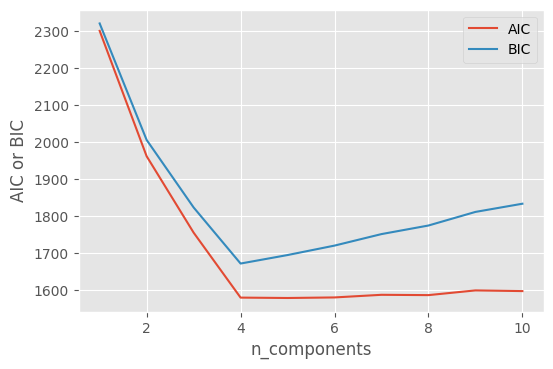
It seems a little frustrating that we need to choose the number of clusters by hand. Is there any automatic way of selecting this? The answer is yes. Because the GMM yields a distribution of probabilities, it can be used to generate new samples within that distribution. We can then estimate the likelihood that the data we have observed would be generated by a particular GMM. Therefore, we can generate a set of GMMs with different numbers of clusters and find which one has the maximum likelihood of generating (reproducing) our observed data.
First, we make a set of GMMs with n_components ranging from 1 to 10:
# a set of numbers of clusters
n_components = np.arange(1, 11)

# create the GMM models
models = [GMM(n, n_init=20).fit(X_stretch) for n in n_components]
The GMM in sklearn has a couple of built-in methods to estimate how well the model matches the data, such as the Akaike information criterion (AIC) and the Bayesian information criterion (BIC):
# Akaike information criterion
aics = [m.aic(X_stretch) for m in models]

# Bayesian information criterion
bics = [m.bic(X_stretch) for m in models]
Plotting AIC and BIC against n_components, we find that 4 is the optimal number of clusters:
plt.figure(dpi=100)
plt.plot(n_components, aics, label='AIC')
plt.plot(n_components, bics, label='BIC')
plt.legend(loc='best')
plt.xlabel('n_components')
plt.ylabel('AIC or BIC')
plt.show()
Clustering using BGM
Both k-means and GMM require users to provide the number of clusters. In practice, however, the number of clusters may be unknown. Bayesian Gaussian Mixture or BGM can solve this problem. For BGM, users only need to provide the maximum number of clusters, leaving BGM to infer the effective number of clusters from data.
First, we create a BGM model and do fit and predict, with the maximum number of clusters being 10.
# create BGM and fit
bgm = BGM(n_components=10, n_init=20).fit(X_stretch)

# make predictions
y_bgm = bgm.predict(X_stretch)
Now we plot the results. It shows that BGM correctly find the right number of clusters, 4.
# plot data points with predicted labels
plt.figure(dpi=100)
scat = plt.scatter(X_stretch[:, 1], X_stretch[:, 0], c=y_bgm,
                   s=20, alpha=0.7, edgecolors='k', cmap='viridis')
add_ellipses(bgm, plt.gca(), cm.get_cmap('viridis', bgm.n_components),
             weight_threshold=1e-3)
plt.xlabel('Feature 1')
plt.ylabel('Feature 0')
plt.gca().add_artist(plt.legend(*scat.legend_elements(),
                                title='Clusters', bbox_to_anchor=(1.3, 1.)))
plt.gca().set_aspect(1)
plt.show()

# print scores
print('Homogeneity score = %.3f' % metrics.homogeneity_score(y_true, y_bgm))
print('Completeness score = %.3f' % metrics.completeness_score(y_true, y_bgm))
print('V-measure score = %.3f' % metrics.v_measure_score(y_true, y_bgm))
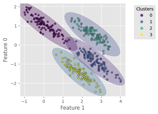
Homogeneity score = 0.990
Completeness score = 0.990
V-measure score = 0.990
Let us check the weights of the 10 clusters as we specified for BGM. Clearly, only four clusters are effective, with a weight not significantly smaller than 1.
print(bgm.weights_)
[2.49476558e-01 2.53766698e-01 2.49260275e-01 2.47251659e-01
 2.22555571e-04 2.02322865e-05 1.83929878e-06 1.67208980e-07
 1.52008163e-08 1.38189239e-09]
Exercises:
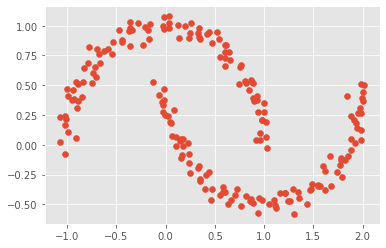
The famous
two-moonsdataset can be generated bysklearn. Work out the best number of GMM clusters for replicating this data.
# load the two-moons dataset
Xmoon, ymoon = make_moons(200, noise=.05, random_state=0)
plt.scatter(Xmoon[:, 0], Xmoon[:, 1])
<matplotlib.collections.PathCollection at 0x7fdf19e0ceb0>
Use k-means or GMM to cluster one or some of the standard “toy” datasets we have used to practice classification, such as
iris(n_features=4) andwine(n_features=13). You may notice that the complexity of the problem rapidly grows with the number of features. In autoencoder_basics.ipynb, we will train an autoencoder to reduce the input dimensionality for clustering.
# load iris dataset
iris = sklearn.datasets.load_iris()
print(iris['DESCR'])
.. _iris_dataset:

Iris plants dataset
--------------------

**Data Set Characteristics:**

    :Number of Instances: 150 (50 in each of three classes)
    :Number of Attributes: 4 numeric, predictive attributes and the class
    :Attribute Information:
        - sepal length in cm
        - sepal width in cm
        - petal length in cm
        - petal width in cm
        - class:
                - Iris-Setosa
                - Iris-Versicolour
                - Iris-Virginica

    :Summary Statistics:

    ============== ==== ==== ======= ===== ====================
                    Min  Max   Mean    SD   Class Correlation
    ============== ==== ==== ======= ===== ====================
    sepal length:   4.3  7.9   5.84   0.83    0.7826
    sepal width:    2.0  4.4   3.05   0.43   -0.4194
    petal length:   1.0  6.9   3.76   1.76    0.9490  (high!)
    petal width:    0.1  2.5   1.20   0.76    0.9565  (high!)
    ============== ==== ==== ======= ===== ====================

    :Missing Attribute Values: None
    :Class Distribution: 33.3% for each of 3 classes.
    :Creator: R.A. Fisher
    :Donor: Michael Marshall (MARSHALL%PLU@io.arc.nasa.gov)
    :Date: July, 1988

The famous Iris database, first used by Sir R.A. Fisher. The dataset is taken
from Fisher's paper. Note that it's the same as in R, but not as in the UCI
Machine Learning Repository, which has two wrong data points.

This is perhaps the best known database to be found in the
pattern recognition literature.  Fisher's paper is a classic in the field and
is referenced frequently to this day.  (See Duda & Hart, for example.)  The
data set contains 3 classes of 50 instances each, where each class refers to a
type of iris plant.  One class is linearly separable from the other 2; the
latter are NOT linearly separable from each other.

.. topic:: References

   - Fisher, R.A. "The use of multiple measurements in taxonomic problems"
     Annual Eugenics, 7, Part II, 179-188 (1936); also in "Contributions to
     Mathematical Statistics" (John Wiley, NY, 1950).
   - Duda, R.O., & Hart, P.E. (1973) Pattern Classification and Scene Analysis.
     (Q327.D83) John Wiley & Sons.  ISBN 0-471-22361-1.  See page 218.
   - Dasarathy, B.V. (1980) "Nosing Around the Neighborhood: A New System
     Structure and Classification Rule for Recognition in Partially Exposed
     Environments".  IEEE Transactions on Pattern Analysis and Machine
     Intelligence, Vol. PAMI-2, No. 1, 67-71.
   - Gates, G.W. (1972) "The Reduced Nearest Neighbor Rule".  IEEE Transactions
     on Information Theory, May 1972, 431-433.
   - See also: 1988 MLC Proceedings, 54-64.  Cheeseman et al"s AUTOCLASS II
     conceptual clustering system finds 3 classes in the data.
   - Many, many more ...