Example of overfitting and underfitting in machine learning
tags: [machine_learning research Getting the right complexity is one of the key skills in developing any kind of statistically based model. This post briefly explores the concepts of bias and variance, providing Python code and data for a worked example.
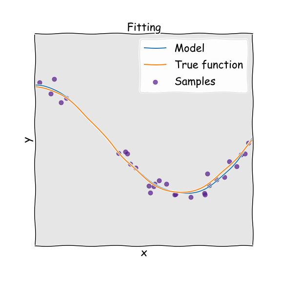
Bias and variance are two terms you need to get used to if constructing statistical models, such as those in machine learning. There is a tension between wanting to construct a model which is complex enough to capture the system that we are modelling, but not so complex that we start to fit to noise in the training data. This is related to underfitting and overfitting of a model to data, and back to the bias-variance tradeoff.
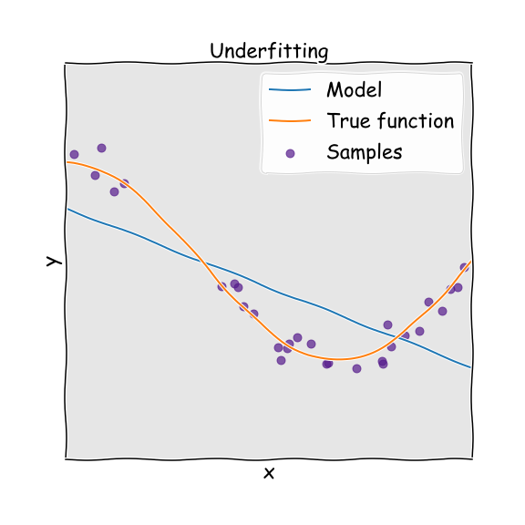
If we have an underfitted model, this means that we do not have enough parameters to capture the trends in the underlying system. Imagine for example that we have data that is parabolic in nature, but we try to fit this with a linear function, with just one parameter. Because the function does not have the required complexity to fit the data (two parameters), we end up with a poor predictor. In this case the model will have high bias. This means that we will get consistent answers, but consistently wrong answers.
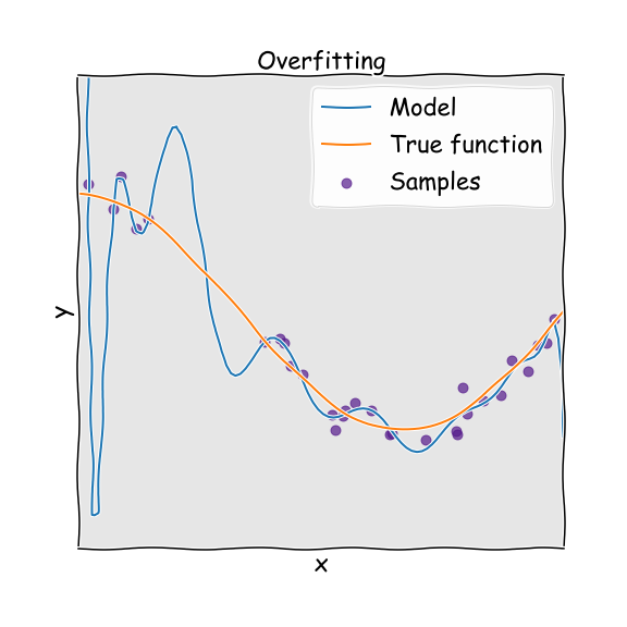
If we have overfitted, this means that we have too many parameters to be justified by the actual underlying data and therefore build an overly complex model. Again imagine that the true system is a parabola, but we used a higher order polynomial to fit to it. Because we have natural noise in the data used to fit (deviations from the perfect parabola), the overly complex model treats these fluctuations and noise as if they were intrinsic properties of the system and attempts to fit to them. The result is a model that has high variance. This means that we will not get consistent predictions of future results. For a striking and devastating example of the dangers of overfitting, see this excellent article which includes a section on the Fukushima disaster.
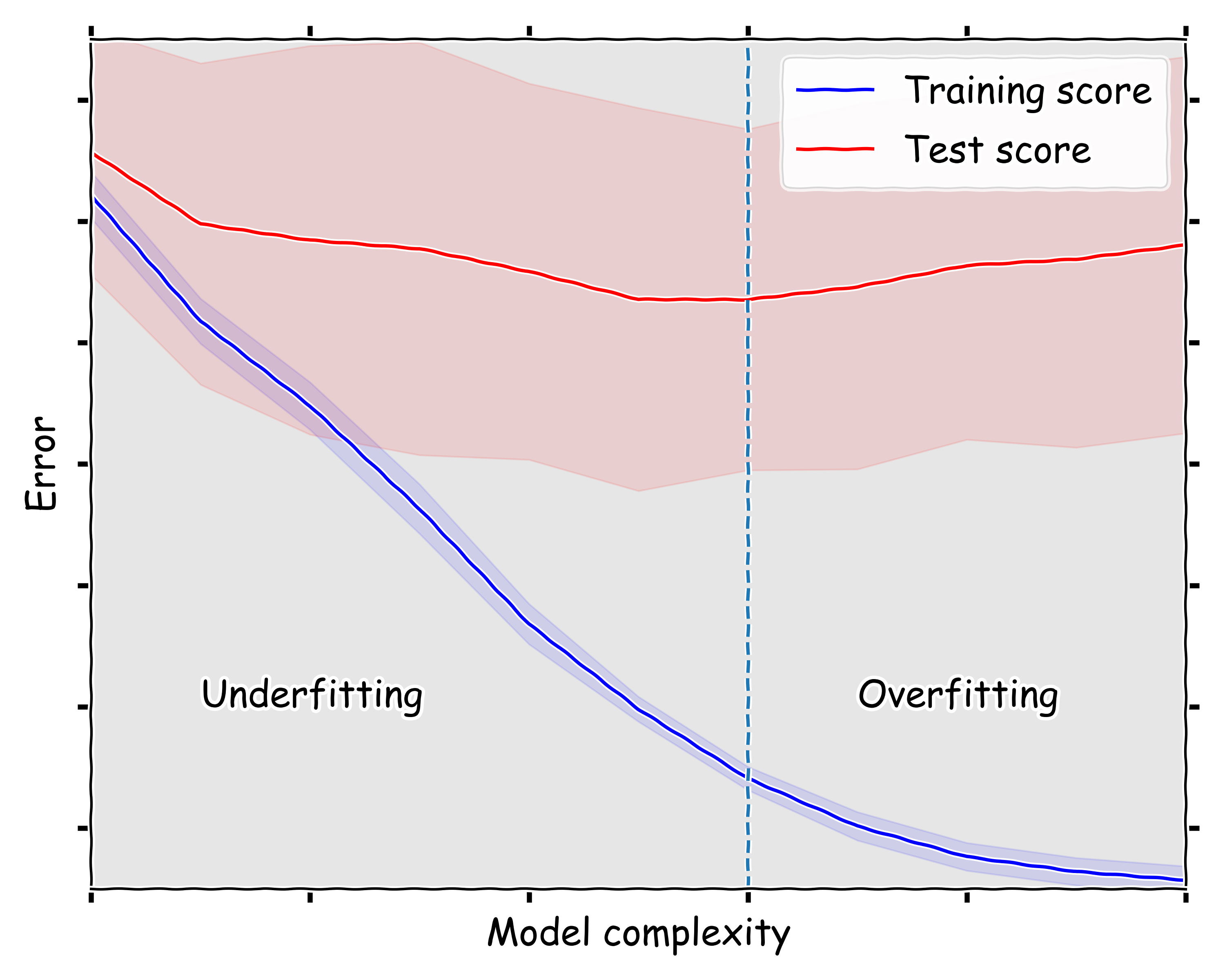
In order to find the optimal complexity we need to carefully train the model and then validate it against data that was unseen in the training set. The performance of the model against the validation set will initially improve, but eventually suffer and dis-improve. The inflection point represents the optimal model. To illustrate this process below I have the Python code required to build a model.
A worked example
For training data we are going to use the Titanic data set, which is available to download from my GitHub page.
We start by importing the modules required. Aside from standard Python packages, you will also need to install pandas (for reading data) and sklearn (provides statistical models). Both of these are available to install via pip.
import pandas as pd
import numpy as np

import matplotlib.pyplot as plt

from sklearn.ensemble import RandomForestClassifier
from sklearn.model_selection import GridSearchCV
from sklearn.model_selection import cross_val_score, learning_curve, validation_curve
The next step sets up plots to look the way I like them, you can ignore it or use it.
import matplotlib as mpl
# Default parameters for matplotlib plots
mpl.rcParams['xtick.labelsize'] = 22
mpl.rcParams['ytick.labelsize'] = 22
mpl.rcParams['figure.figsize'] = (10, 8)
mpl.rcParams['axes.facecolor'] = (0.9,0.9,0.9)
mpl.rcParams['lines.linewidth'] = 2
mpl.rcParams['axes.grid'] = True
mpl.rcParams['grid.color'] = 'w'
mpl.rcParams['xtick.top'] = True
mpl.rcParams['ytick.right'] = True
mpl.rcParams['grid.linestyle'] = '--'
mpl.rcParams['legend.fontsize'] = 22
mpl.rcParams['legend.facecolor'] = [1,1,1]
mpl.rcParams['legend.framealpha'] = 0.75
mpl.rcParams['axes.labelsize'] = 22
Prepare data
Now we read in the data, and combine training and test sets into one. We also set up or training dataframe X.
df_train = pd.read_csv('train.csv')
df_test = pd.read_csv('test.csv')
df_comb = df_train.append(df_test)

X = pd.DataFrame()
Now we set up some functions to encode the data in the set into a machine useable format. In this case we turn gender into a numerical function and set family sizes so that they can be 1, 2, 3 or 4. All families larger than 3 are treated as 4; this reduces the spread in the family size variable and increases its significance.
def encode_sex(x):
    return 1 if x == 'female' else 0

def family_size(x):
    size = x.SibSp + x.Parch
    return 4 if size > 3 else size

X['Sex'] = df_comb.Sex.map(encode_sex)
X['Pclass'] = df_comb.Pclass
X['FamilySize'] = df_comb.apply(family_size, axis=1)
We set up new dataframes containing fares and ages and add them to the dataframe X, these will be used later.
fare_median = df_train.groupby(['Sex', 'Pclass']).Fare.median()
fare_median.name = 'FareMedian'

age_mean = df_train.groupby(['Sex', 'Pclass']).Age.mean()
age_mean.name = 'AgeMean'

def join(df, stat):
    return pd.merge(df, stat.to_frame(), left_on=['Sex', 'Pclass'], right_index=True, how='left')

X['Fare'] = df_comb.Fare.fillna(join(df_comb, fare_median).FareMedian)
X['Age'] = df_comb.Age.fillna(join(df_comb, age_mean).AgeMean)
Next we discritize the data, that is we separate up groups of passengers by the fare that they paid and their age.
def quantiles(series, num):
    return pd.qcut(series, num, retbins=True)[1]

def discretize(series, bins):
    return pd.cut(series, bins, labels=range(len(bins)-1), include_lowest=True)

X['Fare'] = discretize(X.Fare, quantiles(df_comb.Fare, 10))
X['Age'] = discretize(X.Age, quantiles(df_comb.Age, 10))
We split the data again into training and test sets, on the same boundary as at the start.
X_train = X.iloc[:df_train.shape[0]]
X_test = X.iloc[df_train.shape[0]:]

y_train = df_train.Survived
Set up the model
We now set up our Random Forest model. We also specify that we want to perform 7-fold cross validation for fitting the model.
clf_1 = RandomForestClassifier(n_estimators=100, bootstrap=True, random_state=0)
clf_1.fit(X_train, y_train)
# Number of folds for cross validation
num_folds = 7
Some functions to plot the data
Utility to plot training and validation or test scores
def plot_curve(ticks, train_scores, test_scores):
    train_scores_mean = -1 * np.mean(train_scores, axis=1)
    train_scores_std = -1 * np.std(train_scores, axis=1)
    test_scores_mean = -1 * np.mean(test_scores, axis=1)
    test_scores_std = -1 * np.std(test_scores, axis=1)

    plt.figure()
    plt.fill_between(ticks,
                     train_scores_mean - train_scores_std,
                     train_scores_mean + train_scores_std, alpha=0.1, color="b")
    plt.fill_between(ticks,
                     test_scores_mean - test_scores_std,
                     test_scores_mean + test_scores_std, alpha=0.1, color="r")
    plt.plot(ticks, train_scores_mean, 'b-', label='Training score')
    plt.plot(ticks, test_scores_mean, 'r-', label='Test score')
    plt.legend(fancybox=True, facecolor='w')

    return plt.gca()
And a utility to plot the validation curve of a classifier for training set X and target y. The parameter and its value range can be specified with param_name and param_range, respectively.
def plot_validation_curve(clf, X, y, param_name, param_range, scoring='roc_auc'):
    plt.xkcd()
    ax = plot_curve(param_range, *validation_curve(clf, X, y, cv=num_folds,
                                                   scoring=scoring,
                                                   param_name=param_name,
                                                   param_range=param_range, n_jobs=-1))
    ax.set_title('')
    ax.set_xticklabels([])
    ax.set_yticklabels([])
    ax.set_xlim(2,12)
    ax.set_ylim(-0.97, -0.83)
    ax.set_ylabel('Error')
    ax.set_xlabel('Model complexity')
    ax.text(9, -0.94, 'Overfitting', fontsize=22)
    ax.text(3, -0.94, 'Underfitting', fontsize=22)
    ax.axvline(7, ls='--')
    plt.tight_layout()
We run the plotting for between 2 and 13 parameters, note that the optimal is between 7 and 8 parameters, I already included this line in the above plotting function.
plot_validation_curve(clf_1, X_train, y_train, param_name='max_depth', param_range=range(2,13))